Contents
If you've ever read the WCAG, you know that it's dense. But on top of that, it's mainly written for developers working on implementation.
So when designers read the WCAG, they have to translate and extrapolate it for a design environment.
Here's an example of a WCAG success criterion.


A UX designer would be justified in saying, "Hey! This isn't relevant to the design scope."
After all, focus states are implemented in built prototypes, UAT or when the project goes live.
But the earlier we include accessibility in the design, the easier and more seamless it can be to implement.
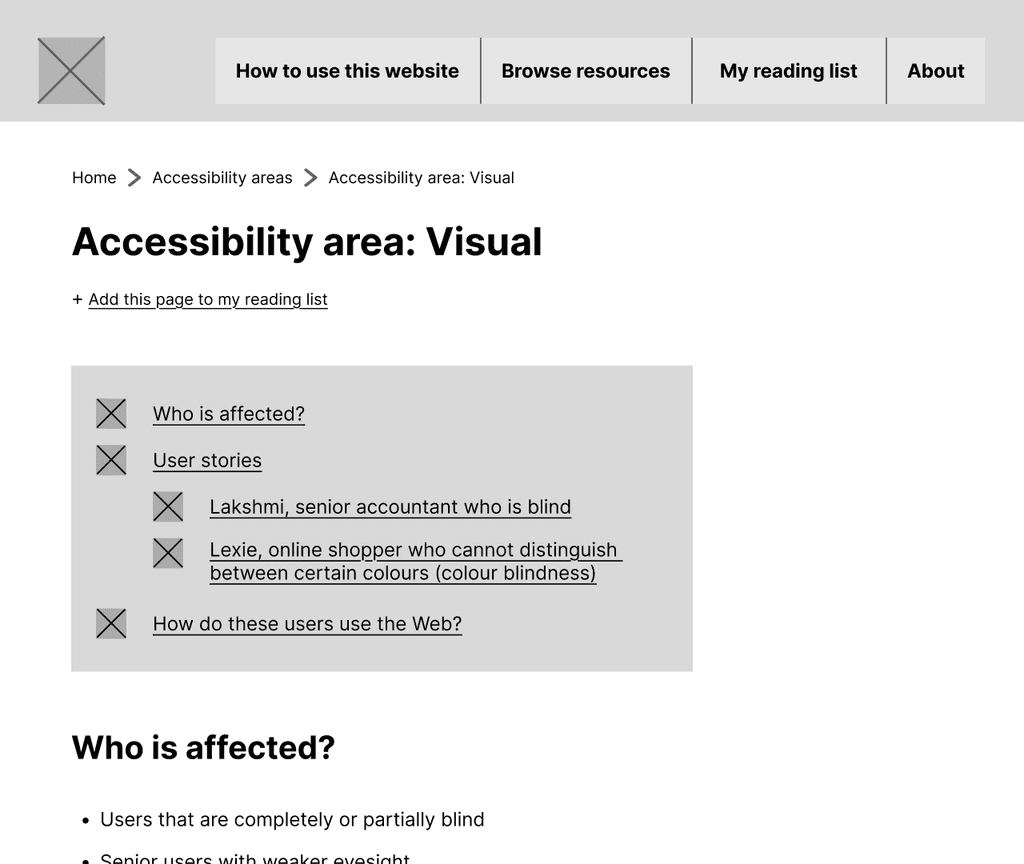
For example, focus order annotations. As the UX designer sketches out wireframes, they are already crafting user flows.
By marking out the focus order during this stage, they can create a cohesive experience for everyone, including keyboard users.
UX designers at every stage: beginner, amateur, professional, expert.
Semi-structured interviews with 9 UX designers: 3 students, 4 early-career, and 2 mid-career professionals.
Explore UX designers’:
current awareness of accessibility
awareness of types of disabilities & how to design for them
sources of education on or exposure to accessibility
perceived challenges and needs when designing for accessibility

I developed three personas, one for each progressive level of familiarity with designing for accessibility.
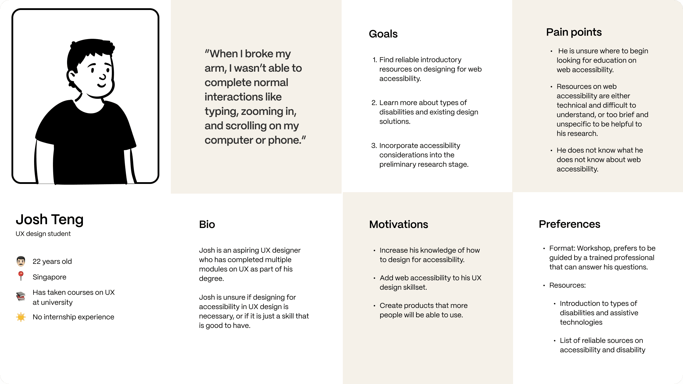
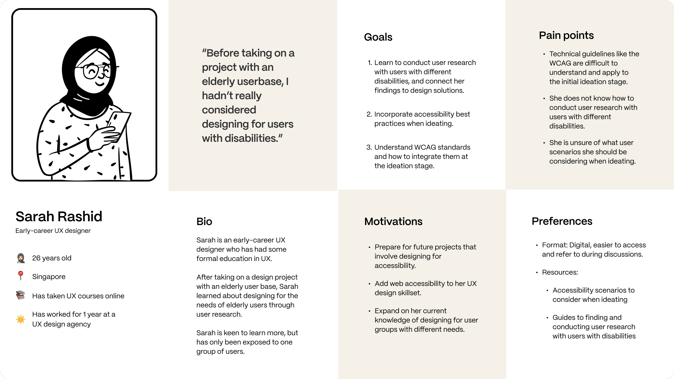
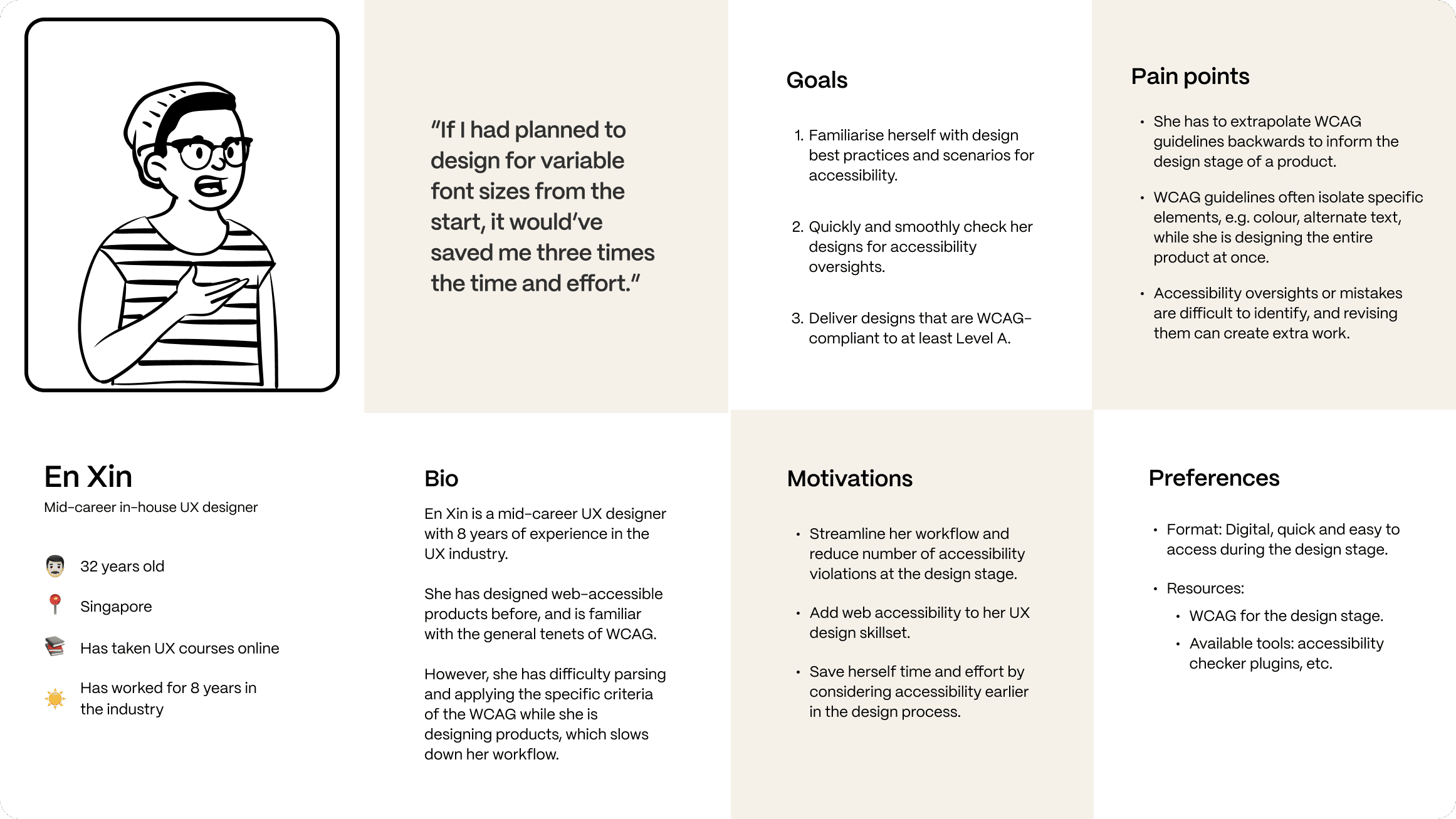
The design solution would thus need to identify the user's goal, broadly categorisable into one of the above personas, and meet that need.
To identify the user's goal and familiarity with accessibility, I sketched out a short questionnaire flow.

Requires the user to make an account to save their preferences
Doesn’t distinguish between different areas of accessibility
Insufficient guidance for inexperienced users
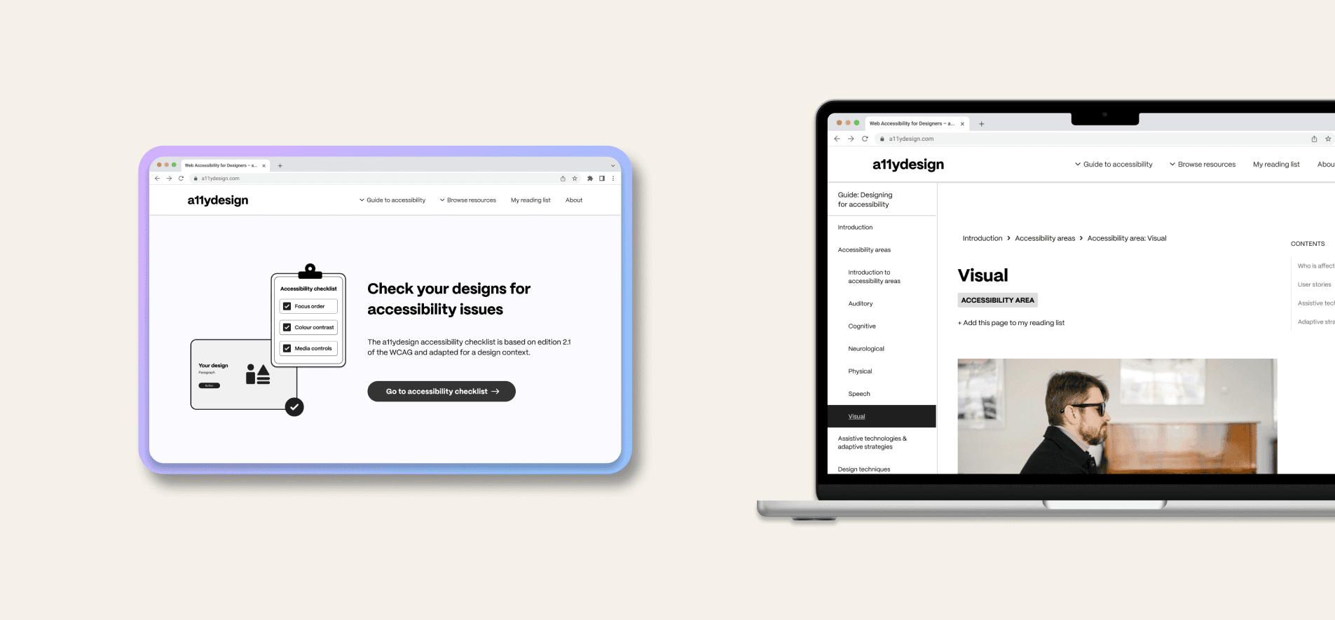
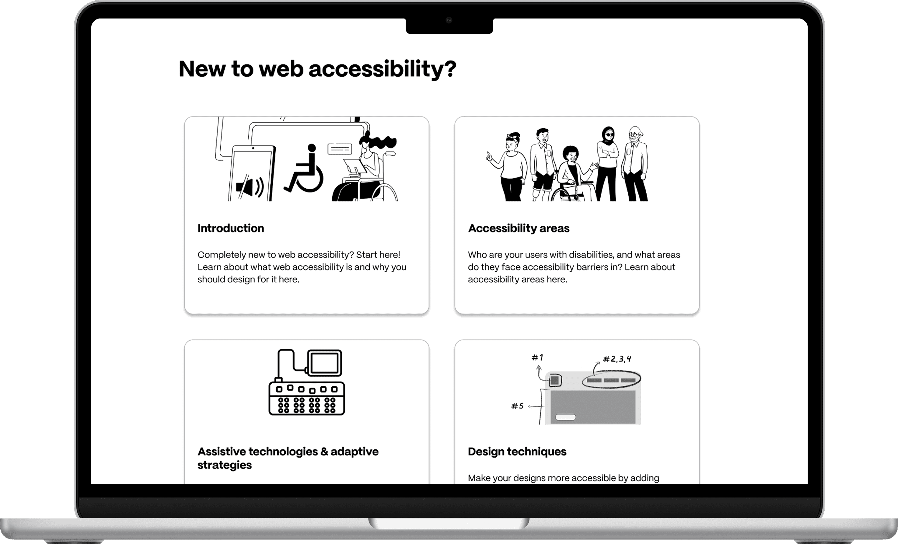
By simplifying the entry points based on the user goal of each persona, I designed a simple home page section to replace the questionnaire.

Provides easy entry points on the home page, no account needed
Sequential presentation offers structured guidance for beginners
Focus on user goals gives users control over their experience
I crafted a working lofi prototype based on the user personas above.


1 round of lo-fi testing
1 round of mid-fi testing
9 UX designers in total
Is the Information Architecture intuitive?
Is the tool effective in helping designers?
Do the users think the tool is useful?
Pretest design task
Prototype exploration & feedback
Posttest design task

Overall purpose of the tool was unclear
Clearer signposting and navigation was needed
Perceived usefulness varies between personas
Expert personas didn't find the prototype useful – it didn't meet their user goals
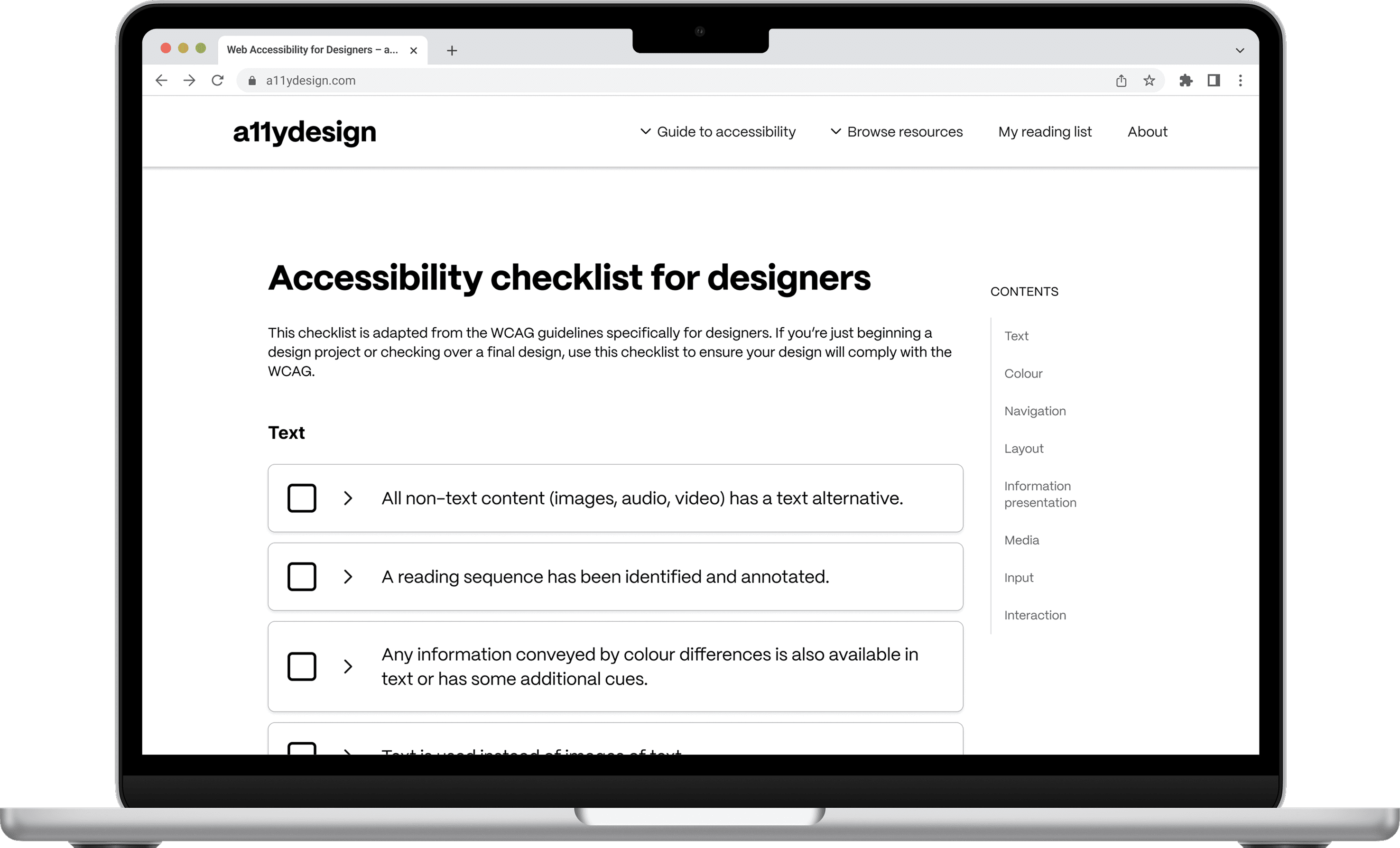
Built a post-design accessibility checklist based on the WCAG 2.1
The 'why' and examples of accessible design techniques are provided for each item

Updated hero text to a clear, concise description of the library
Designed home page sections based on user goals
Cards entry point
Redesigned entry points to resemble existing resource libraries
Modular, non-sequential cards encourage different personas to explore the library
The final prototype for this product is a resource library for UX designers, where users can learn about designing for web accessibility, build on their own professional experience and ensure their designs are always accessible.